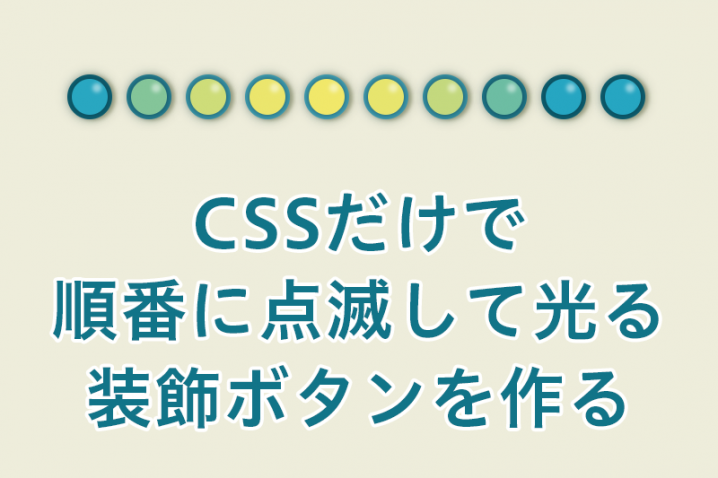
CSSのアニメーションだけを使って順番に点滅する装飾ボタンを作っていきます。
js使わなくてもanimationだけで色々できてCSSも楽しいものです。
目次
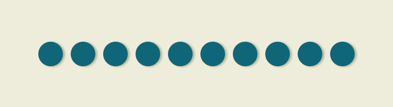
動きのイメージ動画
こんな感じで順番に光る装飾ボタンを作っていきます。
ベースになるHTML
ベースになるHTMLは以下になります。
リストを10個作りました。
<div class="container">
	<div class="circle">
		<ul>
			<li></li>
			<li></li>
			<li></li>
			<li></li>
			<li></li>
			<li></li>
			<li></li>
			<li></li>
			<li></li>
			<li></li>
		</ul>
	</div>
</div>
CSS一式
CSS一式はこんな感じになります。
次の項目から部分の詳細説明をしていきます。
body{
	margin: 0;
	padding: 0;
	background-color: #eeeddb;
}

.container{
	position: relative;
	height: 100vh;
}

.circle{
	position: absolute;
	top: 50%;
	left: 50%;
	transform: translateY(-50%) translateX(-50%);
	-webkit-transform: translateY(-50%) translateX(-50%);
}

.circle ul{
	display: flex;
}

.circle li{
	animation: frame 1s infinite alternate;
	position: relative;
	list-style: none;
	background-color: #0f6679;
	border-radius: 50%;
	width: 50px;
	height: 50px;
	margin: 0 8px;
	filter: drop-shadow(4px 1px 2px #b6b492);
}

.circle li:nth-child(1){
	animation-delay: 0;
}

.circle li:nth-child(2){
	animation-delay: 0.1s;
}

.circle li:nth-child(3){
	animation-delay: 0.2s;
}

.circle li:nth-child(4){
	animation-delay: 0.3s;
}

.circle li:nth-child(5){
	animation-delay: 0.4s;
}

.circle li:nth-child(6){
	animation-delay: 0.5s;
}

.circle li:nth-child(7){
	animation-delay: 0.6s;
}

.circle li:nth-child(8){
	animation-delay: 0.7s;
}

.circle li:nth-child(9){
	animation-delay: 0.8s;
}

.circle li:nth-child(10){
	animation-delay: 0.9s;
}

@keyframes frame{
	0%{
		background-color: #0f6679;
	}
	60%{
		background-color: #0f6679;
	}
	100%{
		background-color: #4eb3c9;
	}
}


.circle li::after{
	content: "";
	position: absolute;
	top: 10px;
	left: 28px;
	width: 10px;
	height: 10px;
	background: #ffffff;
	border-radius: 50%;
	filter: blur(2px);
	-webkit-filter: blur(2px);
	opacity: 0.5;
}


.circle li::before{
	animation: circle 1s infinite alternate;
	content: "";
	position: absolute;
	top: 5px;
	left: 5px;
	width: 40px;
	height: 40px;
	background: #26a6c2;
	border-radius: 50%;
	filter: drop-shadow(0 0 7px #063540);
}


.circle li:nth-child(1)::before{
	animation-delay: 0;
}

.circle li:nth-child(2)::before{
	animation-delay: 0.1s;
}

.circle li:nth-child(3)::before{
	animation-delay: 0.2s;
}

.circle li:nth-child(4)::before{
	animation-delay: 0.3s;
}

.circle li:nth-child(5)::before{
	animation-delay: 0.4s;
}

.circle li:nth-child(6)::before{
	animation-delay: 0.5s;
}

.circle li:nth-child(7)::before{
	animation-delay: 0.6s;
}

.circle li:nth-child(8)::before{
	animation-delay: 0.7s;
}

.circle li:nth-child(9)::before{
	animation-delay: 0.8s;
}

.circle li:nth-child(10)::before{
	animation-delay: 0.9s;
}

@keyframes circle{
	0%{
		background-color: #26a6c2;
	}
	60%{
		background-color: #26a6c2;
	}
	100%{
		background-color: #f1e86a;
	}
}
制作物の細分化
ちょっとCSSが長いので、制作物の内容を細分化して説明していきます。
こんな感じで順に作っていきます。
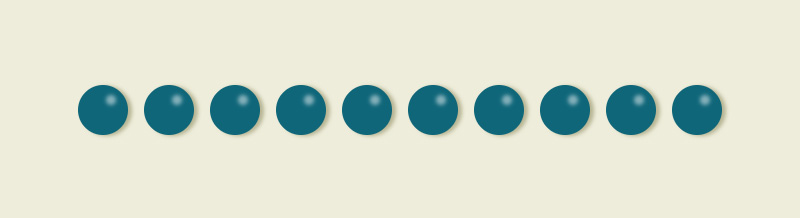
枠を作る
まずは装飾ボタンの「枠」になる部分を作っていきます。
CSSだと「.circle li」部分になります。
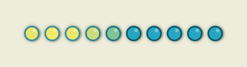
装飾の光の反射部分を作る
装飾ボタン部分に光の反射部分を作ります。
CSSだと「.circle li::after」部分になります。
光るボタン部分を作る
メインになる光る部分を作っていきます。
CSSだと「.circle li::before」部分になります。
枠部分を作ろう
それでは枠部分を作っていきます。
枠のベースCSS
.circle li{
		animation: frame 1s infinite alternate;
		position: relative;
		list-style: none;
		background-color: #0f6679;
		border-radius: 50%;
		width: 50px;
		height: 50px;
		margin: 0 8px;
		filter: drop-shadow(4px 1px 2px #b6b492);
	}
枠のベースになるCSSになります。
アニメーションの注目点は「animation:」部分。
- 「frame」は任意名
- 「1s」はアニメーションの時間(スピード)
- 「infinite」はアニメーションの繰り返し
- 「alternate」は順方向から逆方向への繰り返し。そのままだとアニメーションがプチっと切れてた用に見えてしまうので、アニメーションが終わったら逆再生し戻ってくる為に入れています。
枠の点滅
.circle li:nth-child(1){
	animation-delay: 0;
}

	~

.circle li:nth-child(10){
	animation-delay: 0.9s;
}
装飾ボタンが光ると、反射でボタンも明るくなるであろう事から、枠もアニメーションで点滅させています。
1つ目の枠から10番目の枠まで「animation-delay」を使って、アニメーションの開始時間を指定し、色が変わる時間をずらしています。
animation-nameを設定する
@keyframes frame{
	0%{
		background-color: #0f6679;
	}
	60%{
		background-color: #0f6679;
	}
	100%{
		background-color: #4eb3c9;
	}
}
ここでは「frame」という任意名でanimation-nameを設定しました。
再生時間内の0%~60%~100%時それぞれで背景色を変える事で点滅した様に見えます。
装飾の反射部分を作ろう
装飾ボタンの光の反射部分を作ります。
ここは点滅などはしないので、白い丸を作ってブラー(ぼかす)をかけます。
.circle li::after{
	content: "";
	position: absolute;
	top: 10px;
	left: 28px;
	width: 10px;
	height: 10px;
	background: #ffffff;
	border-radius: 50%;
	filter: blur(2px);
	-webkit-filter: blur(2px);
	opacity: 0.5;
}
「filter: blur」でぼかしを設定し、「opacity」で若干透過しました。
装飾ボタン部分を作ろう
装飾ボタンのベース
.circle li::before{
	animation: circle 1s infinite alternate;
	content: "";
	position: absolute;
	top: 5px;
	left: 5px;
	width: 40px;
	height: 40px;
	background: #26a6c2;
	border-radius: 50%;
	filter: drop-shadow(0 0 7px #063540);
}
装飾ボタンのベースになるCSSになります。
アニメーションの注目点は「animation:」部分。
- 「circle」は任意名
- 「infinite」はアニメーションの繰り返し
- 「alternate」は順方向から逆方向への繰り返し。そのままだとアニメーションがプチっと切れてた用に見えてしまうので、アニメーションが終わったら逆再生し戻ってくる為に入れています。
アニメーションの動きは枠と同じです。
装飾ボタンの点滅
.circle li:nth-child(1)::before{
	animation-delay: 0;
}

~

.circle li:nth-child(10)::before{
	animation-delay: 0.9s;
}
ここも枠と同じアニメーションになります。
1つ目の枠から10番目の枠まで「animation-delay」を使って、アニメーションの開始時間を指定し、色が変わる時間をずらしています。
animation-nameを設定する
@keyframes circle{
	0%{
		background-color: #26a6c2;
	}
	60%{
		background-color: #26a6c2;
	}
	100%{
		background-color: #f1e86a;
	}
}
ここでは「circle」という任意名でanimation-nameを設定しました。
再生時間内の0%~60%~100%時それぞれで背景色を変える事で点滅した様に見えます。
同じ動きのCSSはまとめましょう
今回は制作部分がわかりやすい様にバラにしましたが、同じ動きのCSSなどはまとめた方がより使いやすいかと思います。
.circle li:nth-child(1){
	animation-delay: 0;
}

.circle li:nth-child(1)::before{
	animation-delay: 0;
}
これは枠とボタンのアニメーションスタート設定ですが、内容は一緒ですね。
これを、
.circle li:nth-child(1),
.circle li:nth-child(1)::before{
	animation-delay: 0;
}
この様にまとめちゃいましょう。
まとめ
ここまでビカビカしたアニメーションは作る機会は少ないですが、webのデザイン上ゆ~っくり静かに点滅している箇所なんてあるとオシャレ感は増すかもしれないですね(笑)
ご参考までに^^
CSSコーディングのオススメ本

CSS辞典 第5版 [CSS2/3/4対応]
本書は、Webデザインに必須の技術「CSS」の文法リファレンスです。大幅改訂となる第5版は、現時点の最新状況を反映し、Web制作を学ぶなら必ず押さえておきたい基本のCSS2.1、仕様の策定とブラウザでの実装が進められているCSS3、さらにはその次の規格であるCSS4(Level4モジュール)まで掲載しています。

Web制作者のためのCSS設計の教科書 モダンWeb開発に欠かせない「修正しやすいCSS」の設計手法 Web制作者のための教科書シリーズ
予測しやすい、保守しやすい、最利用しやすい、拡張しやすい―コンポーネントやCSSプリプロセッサを意識した設計・管理の実践など、「ちゃんとCSSを書く」ためのプロの考え方を徹底解説!

1冊ですべて身につくHTML&CSSとWebデザイン入門講座
知識ゼロから体系的に学べる!HTMLとCSSの基本。最新の技術に対応!レスポンシブ、Flexbox、CSSグリッド。手を動かしながら学べる!プロの現場で役立つテクニック。コードの知識からデザインのことまで1冊ですべて学べる!
